Monday, January 5, 2015

0.10.6 update details


There are several things changed.

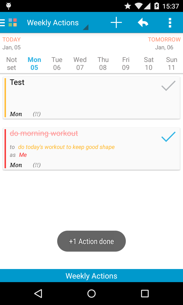
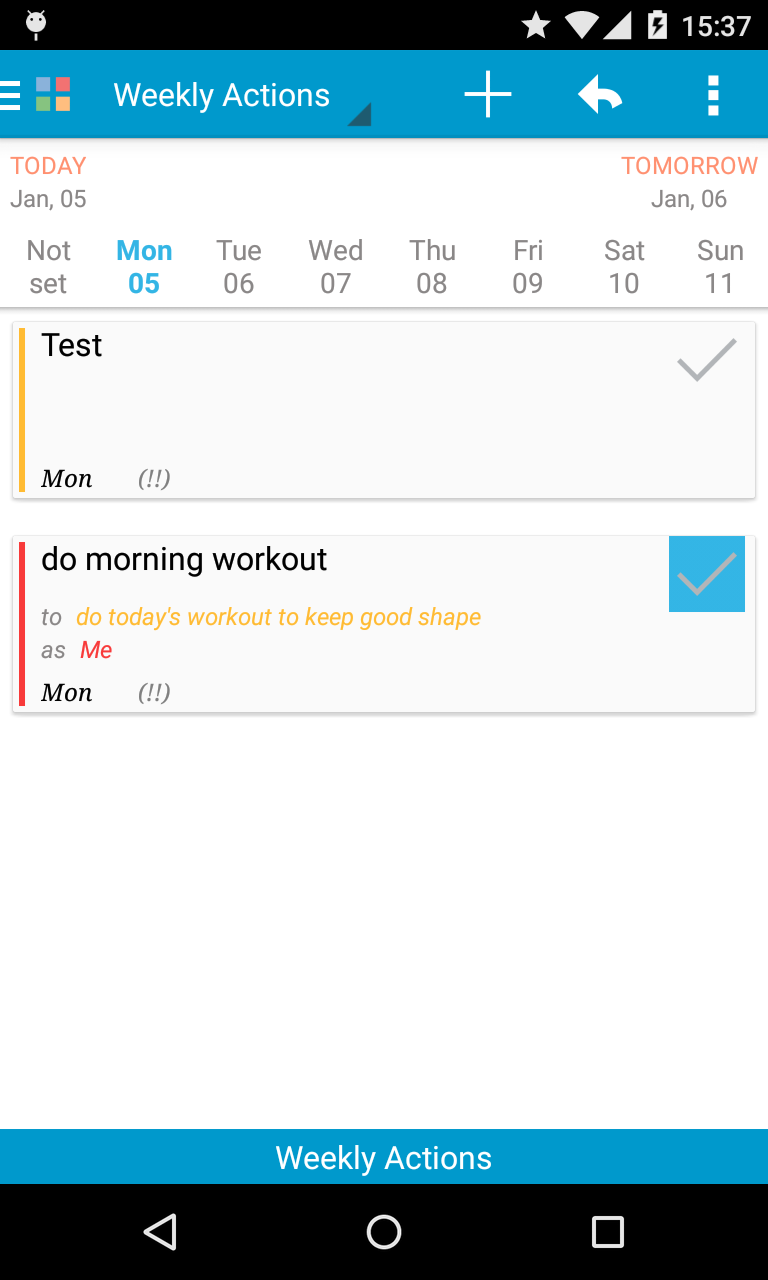
On the Week plan weekly actions:

  • The layout has changed a bit
  • Before the current update an action could be marked as done by swiping the action left or right. This was very counter-intuitive so we've modified it. Now you can do/undo the action by simply clicking on the tick.
  • More information has been added about an action - day set, priority


On the Main page:
  • The layout has changed a bit
  • Pomodoro section has been decoupled from the next action. They say the pomodoro is helpful when tackling your procrastination - it helps you get into the focused mode faster. Doing so you should concentrate on the abstract process of working rather than on doing a concrete action - this is easier for your brain.


On Action page:

  • 'Details to actions' now parses lines, too. I.e., if you have a text separated by new line, you can split it into subactions by end-of-line.
  • Checklist items can be drag-n-dropped by 3-dots at the right of the item. There's a small bug with overlaying, but it will be fixed in the next update.

On all the pages
  • The left menu is modified slightly so that the Home / Exit buttons are at the top of the menu now. This is not final - if the new layout is not better, we'll revert modify again.


There are also some bug fixes and other improvements on some other pages: for example, long-press on FTF and Actions didn't work; an action can be checked as 'done' from notification now; etc.

Wednesday, December 10, 2014

Some status on current development

At the moment, the main development is going around adopting google tasks to our app. We need to find a way to map 2 level tasks structure (lists and tasks) to our multi-level hierarchy: role / goal / action. As said before, we'll map all the lists to roles with the same name, except for special lists called 'My Mission', 'My Influence' and 'Notes'. Currently we are working on the syncing and merging the roles part.

The web app had been started, has since been paused because of lack of time and resources. We'll return to it as soon as we finish the google tasks sync part.

The max count / planned amount of recurrences idea is evolving, adding some new stuff with every update.

The overall enhancements and various improvements within the app never stop, so while concentrating on big goals, we do various smaller actions, too.

And very many thanks to all of you who use the app, point to bugs and deficiencies, give us feedback and just simply support by words! All this comes as a great motivational force to continue working on the app.

Friday, October 17, 2014

FTF squares colors

Why the squares are colored the way they are? Shouldn't the first square be red?

This is a popular question and of course we understand why. The red color is one that best attracts people's attention. It is associated with action and activity. It is usually used to warn about danger (traffic 'STOP' sign), so people are used to paying more attention to it.

Thus your first wish is to put every action into the first square - the Urgent / Important one. You see all your actions both Urgent and Important at the same time. And you rush to do them all. This is the view of classical todo lists. But, it is not if you think about planning.

The first square should hold only the actions, that are burning right now, the crisis actions. That square should either be clear or you be running doing the action from it. The actions from it are usually stressful ones and you shouldn't have them in your normal, everyday life.

The more important among the squares, or even the most important one, is the second square.
Here you put your Important and Not Urgent actions. Don't be fooled by the 'non-urgency' of the actions - the fact that they are not urgent doesn't make them less or not important. It just means that they are under your control - you know about them, you know how important they are and you have thought and planned when you will do them. There's no need to throw everything you are doing and run to do them. So, this is the most important square with actions for you. And since it is the most important, you should be attracted by it more than by others. Thus the red color of the square.

The other colors were chosen so that they try to distract you less.